Guess what???!!!! SRM stickers in now ONLINE and it’s so easy to click and shop and if you want to see what you can do with stickers check out SRM Sticker’s Blog
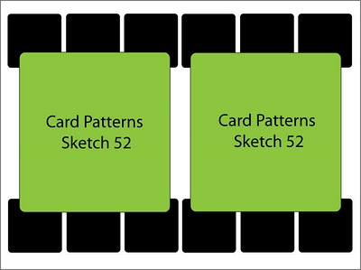
Now how about some card making? Below you will find Card Patterns Sketch #52. I’m a person who likes to follow the rules so with this sketch my right and left brain were fighting. I ended up making THREE cards based on the sketch and let them choose which one they wanted to use. If you leave a comment which one is your favorite I’ll pick a random person and mail a surprise to you.
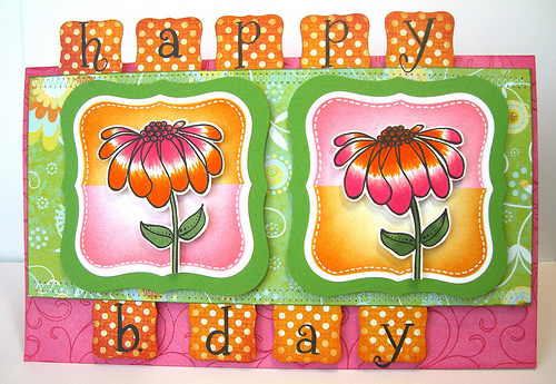
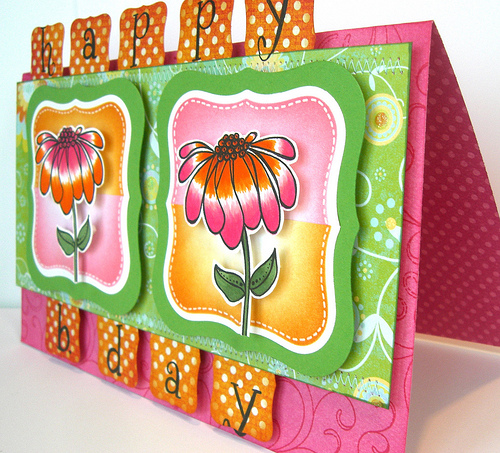
CARD 1: “Reverse Tie Dye Flowers”
I colored these flowers when we were on vacation so it was nice to have one element of the card to start with however ……the layout took some time because my left and right brain were competing with each other. I love the result of the distress inks on the Nestabilities. I was tempted to add dots on the flowers but, decided not to.
Supplies: Hero Arts Cl377 BE Happy, CL260 Curly Alphabet, CG119 Flourish Background
BO Bunny paper, Ranger Worn Lipstick and Spiced Maralade
CARD 2: “I Donut Know”
I was itching to use this coffee cup stamp and I knew that I wanted to stamp a pattern on the cup and color away. When I first saw this stamp I had the desire to sew or quilt the cup holder. I ended up using my sewing machine for this.
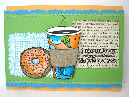
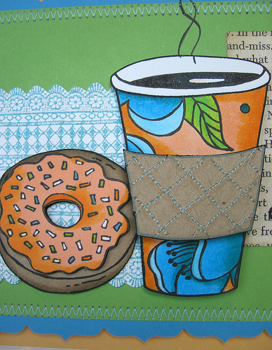
Supplies: Hero Arts Cl403 Have a Donut, K5332 Cup of Coffee, K5333 Rectangular Doily,CG147 Floating Blossoms (pattern on coffee cup) Hero Hues Paper, Copic Markers G14, YG03,YR04,YR61,BG05,BOO,B02,BG49
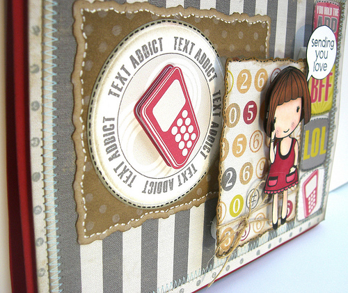
CARD 3: “BFF”
This card is my mom’s favorite and I created this with This DigiKit by Stacy Marks called Text me.
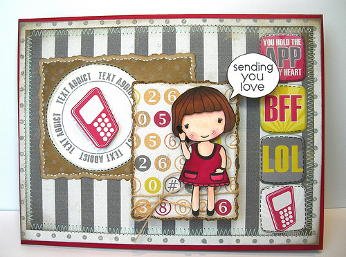
Hero Arts: CG167 Happy Girls, LP143 A Little Note (sentiment)
 Blog Hop and VIDEO & GIVEAWAY
 glorious leaves
 Simon Says Stamp !!! TWO cards & a tutorial
Wow! now that is a really hard choice because I love all of them, but I think the first one is my favorite, because #1 I love flowers and have such severe allergies to them, the only way I get to enjoy them is by picture or stamping. LOL. I also LOVE the vibrant colors you have used.
I am absolutely in love with #1, Kathy! Such wonderfully bright colors!! I love the distressing on the Nestabilities and I am a huge fan of using pink and orange together!! Awesome cards!
how to choose…… they are all gorgeous. But, number ONE for me. Such a bright happy card. Wow Kathy – you are awesome.
I love all 3 of them, the first as it is such a happy one and the last because it’s composed so well and has such lovely details, but my favorite is the middle one, because of the funny sentiment and the originality of it.
I totally love your colours and your stitching is so neat , fantastic cards all of them
Hugs Susie xx
LOVE the first card! looks more like the sketch 😉
Love all of them Kathy,but my favourite is the top one, so bright and cheerful.
“Reverse Tie Dye Flowers” are my favorite . I just love colors what u use for making that card. They just great.
Great job on ALL the cards! I’m bucking the trend and having a hard time deciding between #2 and #3. I think I’ll go with #3 because it’s so different. I just love everything about it!
Looks like a tough sketch. I like the quilted coffee cup holder one, though!
I think I have to go with card number one! They are all adorable, as usual, but I just love the tie dye flowers and all the bright colors that you used! I am so ready for SPRING!
I love the first one! Such a bright, cheery colors! And your coloring on flowers is perfect! Wow, great card!
I hope you know me well enough to know which one I like best ……. the FLOWERS one, of course!!
And it follows the sketch almost perfectly!! Hugs!
The coloring is so so fantastic, I mean, wow, I seriously need to take a class! These cards are dripping cuteness, very very clever stuff!! Love them all!!!
They are all great, but the flowers are my favorite! and I think I’ll give this challenge a try!
All are just amazing Kathy, but my fav would be the last one. Just love the colours and the other little bits and pieces on it. It is quite a challenging sketch.
All of these are so gorgeous – fun and lots of color pizzazz! I just can’t get over your donut card, love that matching cup!
you have done it again, sista!! how can i pick one?? they are all gorgeous! I do love the one that you used the new digi kit though. it’s a very cool kit and you used it beautifully with the cute little girl!! =)
Defintly the third one!!! So cute 🙂
Great work! I really like the first AND second one but if I have to pick my fav I would say the first one! They are all really cute.
lovely cards
Hi! I really like the DONUT card. It’s so cute. I like them ALL actually but if I had to pick …. lol.
Cheers xxx
HI Kathy what a tough decision to be making………I really like them all but I think the coffee & doughnut card is so pretty especially with all the flowers on the cup xoxoxoxo
Loving all 3 cards but I think the girl on the Text Me card is just so very sweet.
OMG…It’s so hard to choose,Kathy! All of these are gorgeous! But My favorite is BFF card! Really cute!
All three are beautifully created….I would have to go with your mom on this one with #3card. My kids are burning up the texting lately so it fits.
smiles…
Kathy, your cards are always fantastic and it is hard to decide. I think the one I like the most is the second one. I like the colors, sentiment and details. TFS
I adore you , you are so creative ! Your cards always so beautiful !! I love them all !!!
My favourite is the Donut one. So cute!
I have to go with my first instinct Kathy, which is the first one. I just love all the bright colours. However, you are so naughty, I kept looking and looking trying to decide, and in the end I fell in love with all of them. Not hard really.
Hi Kathy! Love all the cards! But because I am so into food, I like the second one best!
Hugs,
Vanessa
I love all three, of course! But I tend to choose the food one(you know me) although I really like he third one, too! So I guess it’s a tie for me between #2 and #3! Muahahahhahahahhahaha
Must I pick ONE??? Love them all. Great colours on all three cards, and such great images too. I think card 3 just nudges it for me because I love that little girl and her cute ‘bob’ hairstyle! Jo x
This is a hard choice, all three are great, but a need a breath of spring so I’ll go with #1.
so hard cuz they’re all so cute, but I think I like the flowers the best because it’s so bright~ and the coloring is amazing. 🙂
I can’t pick a favorite they are all so good! I love the white highlights on the flowers in the first one-WOWSERS! And the pattern on the coffee cup- genius! And the last card is just TOOO fun!
each and every one of your projects is pure inspiration to me but i must say i do love the drama of those flowers..beautiful gorgeous magnificent cards..
Wow… difficult to pick one. I adore your colours on the first card and wonderful design, but I think my fave would be the third one. Have a great week, Hugs
I Donut Know is my favorite. I haven’t had a donut in years but everytime my husband and I pass a donut shop…I tell him how much I am craving donuts.
I love the first one! So bright and cheery!
OK…..Ms stamping GENIUS!!! How on Earth can I pick a FAVE???? You make this really tough as I LOVE LOVE all three!!! I will have to co with the Fabulously colored Coffee cup card…it is just Awesome….but then they all are!!!!!
Hello Kathy, what lovely cards.. bit hard to choose though. I like the first one for the colours only, but I think I prefer the third one mostly, although the donut and coffee images are so nice too. So my preference is the third! Hugs xx
Beautiful cards Kathy!
They all cute. But, I love card number 2 more! 🙂
i LOVE the colors of card #1. such happy & bright colors! i always love me some bright & bold colors on cards!
card#2 is very ‘today’. i love that it is unique and the blue stitching stands out nicely on the gray papers. i cannot live w/out my iPhone! that text addict sentiment would be perfect for my niece!! (who makes that—HA?)
I love all of them, Kathy! You are just amazing talented!! All of your cards are gorgeous and cheery, you totally ROCK every single time!!
they’re all beautiful, but I’m picking #3!!!
Karen K
You are so talented, Kathy! I love all three, but the tie dye flowers really stand out and say, “boy, howdy!” to me. Great colors, textures, vibrancy, everything. I think you’ve got a winner there!
WOW! A super trio of cards…you have been very busy! I don’t think I can pick a fave, because they are all so fabulous. But, if I have to…oh I just can’t! LOL!! Ok, okay…number 3 just takes the cake on cuteness ;D
[b]Nuvi 1490T[/b]
Nuvi 1490T имеет широкоформатный экран (диагональ экрана 5″ (12.7 см)). Этот ультра тонкий навигатор произносит названия улиц (Внимание! Функция работает только в Европе), имеет пешеходный режим для навигации и рассчитывает более экономный маршрут с помощью функции ecoRoute™.
Пользуйтесь общественным транспортом с cityXplorer™
С улучшенным пешеходным режимом nuvi 1490T является идеальным навигатором для передвижения по городу на общественном транспорте. Необходимо загрузить дополнительное ПО cityXplorer™ и вы будете знать, где находятся остановки автобуса, трамвая, метро и других видов транспорта (Внимание! Функция работает только в Европе).
[url=http://info.je1.ru/GPS_006.html]Подробнее…[/url]
Im voting on the top one it was your card that made play in card patterns this week I love it .But I love all of them .No one has came and looked at the card I made for the challenge yet .But I love everything you have up .Hugs Sarah
LOVE them all but the first just POPS!
hi kathy – my vote is for the first one – love the bright color palette and how you reversed the colors. a good inspiration for me since i don’t often work in those colors. by the way – u suggested i send to “cards for kids” which i will probably do, but added another to my own weekly card list – a lady (97 years) in an assisted living in wisconsin who loves to get mail. take care and love those stamps u sent me.
Love the first card for its sheer bright colors. It would brighten anyone’s day…simply superb!