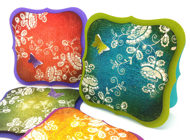
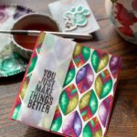
Hello Friends, How are you? Thanks for stopping by day 2 of my blog week at Penny Black. This set of note cards is my interpretation of some batik fabric. The distress inks pared with Penny Black’s Mix & Match papers worked together so beautifully.
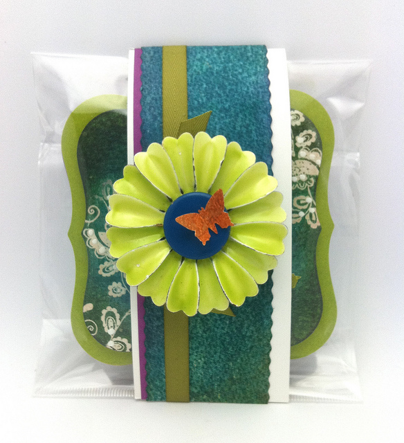
The packaging from the transparent & clings sets always comes in handy for gift packaging. I let you in on a little secret. I forgot the envelopes. Oh well…. I think the vintage pin will make up for that. I love to use these metal vintage pins on my bulletin board.
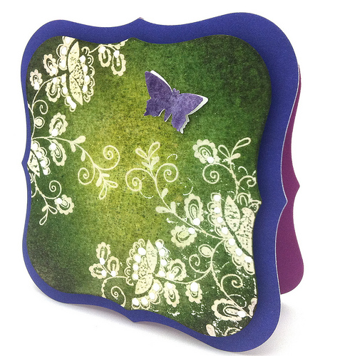
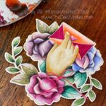
I just want to give you a close up on each card and a tutorial to follow.
The enamel accents is that one extra detail that makes the card …gives it that extra dimensional pop.
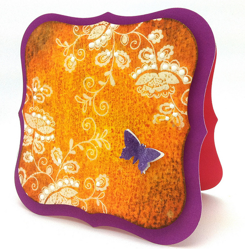
I have been layering my butterflies for more lift as you see in all of these cards.
In this post I used vellum as my second layer that I stamped on for a more delicate look.
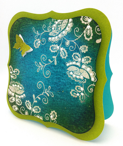
The corners I used Chipped Sapphire. This combo is my favorite. Which one is yours??

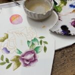
This powder tool gives me a clean image when I use it before I emboss. Just brush it over your paper. For today I’m using watercolor paper.

I just smeared my ink pads right onto the paper. I started with the lighter colors in the middle.

Add some worn lipstick bringing the color from the edges toward the center. Then add the darker color in the corners with Barn Door.

I like to stamp the pad directly onto the craft mat. Then I smear the ink with a wet wipe to get these lines of droplets in the ink.

Lay the paper down onto the droplets. Pick it up and see if you are happy. Perhaps repeat or add some different colors.

When I was finished I added more ink to the corners. Rust to the orange, Purple to the blue, green and red.


I stamped the ink pads on some card stock to “color” them then stamped the paisley background on top. Punch out your butterflies on some white paper and the inked paper.
That’s it for today. Off to work on my card for Thursday. Thanks again for stopping…I really appreciate it. Hugs, Kathy
P.S. Here is Penny Black’s blog in case you would rather leave a comment there 🙂
|
|
|
|
|
|
|
|
|
|
|
|
|
|
|
|
|
|
|
|
|
|
|
|
|
|
|
|
|
|
|
|
|
|
 What do you do with your Christmas stamps?
 Day 25. Wine Tasting Bridal Shower & Giveaway
 simon says stamp blog hop and giveaways
these cards look heavenly 🙂 Love them to pieces!! Thanks for the tutorial!
Kathy… love how you show how to do this technique. The set looks stunning. LOVE distress ink and these showcase it perfectly
Love these cards beyond words Kathy. Your batik effect is perfect. Thanks for the tutorial too. You really made my day…have a big smile first thing in the morning after seeing this post of yours:))
These are really beautifull Kathy. Love them. Have to try myself.
WOW! This set is simply gorgeous! Wonderful colors and fun technique!!!
WOW Kathy these are stunning! So colorful and fresh designs! LOVE them all!
Very nice and bright colours,will try it out tonight.
hugs
doreen
AMAZING…… just AMAZING.
These are beautiful!
Sandra ltb
Kathy, your work is always so amazing. Thanks for the tutorial – I’m going to have to try this on a card.
Beautiful!! loved this technique. I wonder if I could try with some other medium as I don’t have these.
I love this technique! I’m going to have to share it with my stamp club when it’s my turn to “teach.”
While i was looking at your FABULOUS cards, i was thinking… and found the word; Batik look, from your post! I luv the last one also, and i think you chose the RIGHT kind of stamp to make these wonderful cards. It’s the mixture of the great choice of stamp, great choice of ink (distress) & colors, and of course, those white dots pop out on your cards!! I also liked that after you inked the CS, you also inked those tiny ink dots, from craft sheets! Also luv those new PB CSs!:-)
Love it! Such a pretty colors!
Wow the cards are gorgeous! Your favorite color combination is also my favorite one.
Marie-Anne
These are gorgeous – the colors are wonderful. I agree – love those distress inks. The stamp you used is perfect and the positioning of the images just RIGHT. Thank you for sharing your technique too.
What beautiful cards! I LOVE this technique with Distress Inks! FABULOUS.
Awesome cards!!! Thanks for sharing the technique!!!
beautiful beautiful cards!!!
Wow, fabulous colours Kathy and I love the smearing ink technique, it reallys adds some nice texture. Thanks for sharing all your tips!
The aqua & green is my favourite. Thanks for so much info & I love the way you’ve layered the butterflies & used a inked & stamped pieces of cardstock to punch them from – it makes them so different & it is the detail which makes a card stand out from the crowd. Those enamel dots are amazing.
Paula (PEP)
Looooove these, Kathy! So colorful!
These cards are just too pretttyyyy!!! I think I’m going to give this tut a try as soon as I get home tonite! Thanks for the inspiration Kathy!
Great tutorial, Kathy! This technique I am going to try. Love the notecards!
Gorgeous! Jo x
Wow Kathy,
These are absolutely beautiful! I am definitely going to try this technique. I made note cards for the females in my family this past Christmas and there will definitely be a few sets of these for the next Christmas!!
My favorite it the orange and purple notecard. The contrast in the colors are so dramatic, that I really love that look.
Thanks for the inspiration!
*Hugs*
~Andrea
What a nice ‘batik’ effect! I did not that we can actually create a ‘batik’ card without using the real ‘batik’ or ask a ‘batik’ expert to do it!
Schitterend zeg……
Warme groetjes,
Anita
Wow Kathy! These are jaw dropping gorgeous! Love the card shape, but the dynamic and bold colours really make the stamped/embossed image stand front and center stage. It is like looking at a masterpiece and really these four could be matted side by side and then framed with a deep chocolate frame. Then displayed as a home decore piece in one’s home. Just wonderful.Hugs
thanks for the tutorial!!! wld love to ry these sumtime 🙂