 |
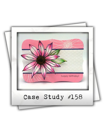
| Hello Friends, Welcome to my third installment as the guest muse over at the CASE Study Challenge blog. (CASE Study selects a few cards from my archives and uses them as inspiration for a weekly challenge.) Today is Case Study #158 If you want to see card #1 click here or card #2 click here. |
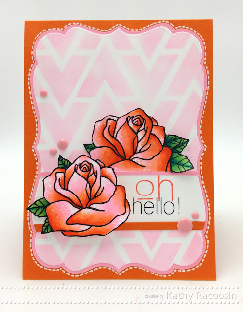
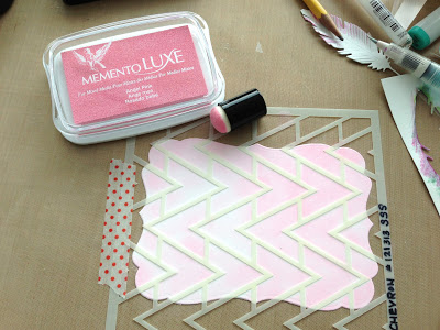
Graphic prints are so on trend in the fashion arena so it’s not a surprise that Simon Says stamp delivered beautiful stencils for their STAMPtember® event. Using stencils as a graphic twist to your cards really makes them pop! This particular stencil is called, “Chevron Pattern”.
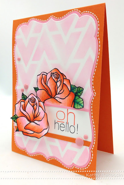 |
| These beautiful flower stamps are from Janes Doodles. It’s so much fun knowing someone before they design their own stamp line. I have always been a fan of Jane’s illustrations and her flowers are no exception. For the sentiment I used a combo from this & this stamp set. |
With a light hand it’s super easy to get a beautiful geometric background. I do believe that having some of these daubers on hand are pretty essential. The nice thing is the daubers last a long time especially if you store them in something like this.
(I like to write the stencil number with a permanent marker on the stencil)
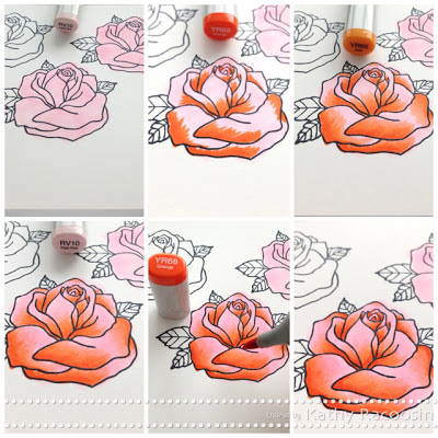 |
| Mixing colors that aren’t the combo you might typically reach for are super fun to play with. If you are new to Copic markers I recommend starting with a blending set like this one because the color choices are great in the sets. |
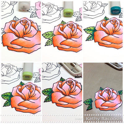 |
| If you click on these pictorial tutorials you can see them larger and I hope you find them pretty easy to follow. Would love to hear if you find them helpful. Prepare to be dazzled when you hop on over to the CASE Study Challenge blog to see what the DT created. Thanks for your visit today and see you soon. Hugs, Kathy P.S. If you want to share your card for the CASE Study Challenge with me you can tweet me @kathyrac or find me on instagram kathyrac. I would love to see what you created. P.S.S. Stay tuned for a blog hop tomorrow with great prizes. P.S.S.S (lol) & I am giving away this Simon Says Stamp Card Kit here. (or scroll down) |
CARD SUPPLIES AND LINKS: click on the link to see where you can purchase the products I used on my card 🙂
 Day 27. Mixed Media Enhancing Your Copic Coloring
 Day 19. Florida Registration is OPEN
 origami day three

Absolutely gorgeous! Love how you used the pink Luxe ink along with your Copics – such a beautiful card, Kathy! ♥
Adore your card, Kathy!!
Definitely CASEing it! Will share my card once I have created one!
I’ve already blown my monthly budget purchasing stuff from your links.. and you keep using other yummy stuff 😛 Such an enabler!
I’d not have thought of combining these colours so very helpful seeing it done bit by bit. You’re giving me ideas this week – but having to keep a pristine craft room for house viewings does not help – I desperately need to learn CAS!!
Thanks again for all you do
Paula (PEP)
Your card is beautiful. Great stencil background. And your
coloring is superb as always.
Love the stencil background. So pretty.
HOW BEAUTIFUL KATHY!!!!!!!! LOOOOOOOVE the Rose colored with markers that AREN’T in the coordinated combo category!!!!!!:) Makes for a FABULOUS LOOKING Rose!!!!!!!!!!!!! AND the stencil is SUPER NEAT TOO!!!!!!!!!!!!:)
Very pretty – thanks for the tutorial and your fabulous coloring tips, Cathy!
So beautiful!
Gorgeous!!! xo
Wow, gorgeous colouring of the roses.
Those roses are beautiful! I have to get some of that Luxe ink…soon.
what a gorgeous card. I love the cute image and your colouring is fab.
very pretty!
So gorgeous!!
Thanks for sharing the technique on the stensils. I absolutely love your Roses. They look so real and beautiful.
Really Pretty Card!
I’m not a fan of orange but love how you blend the pink with it for the roses. Will definitely try now! The little white areas & dots give the roses an added depth and softness.
I would never have put such a bold graphic with the roses, but like how the softly blended areas look with them. Enamel dots add just the right finish!
I love your cards Kathy. The flowers are gorgeous and I love the background. Thanks for sharing.
Oooh so graphic and trendy, Kathy – I love it! I’m in awe of your colouring skills; you inspired me to play with my markers again this week! Thank you! 🙂
Luhhhhhve that color combo!!!
lovely!!
Love your color combo and your card !!!
This is such a stunning card. Love how you blended diff group of copics…
So pretty! Love those roses, and that background too! Great card. Thanks for sharing.
Katie B.
Both of these cards are gorgeous Kelly – Thank you so much for all the inspiration at case study this month – I love seeing all your cards – hugs xx
OMG!! Loving your card for this week!! Hope to play along!! 😉 have a Fabulous Week!! 😉