Hello Friends, How are you? Any different than yesterday? Since it’s Monday that means back to the grind….so I will wish you a good start to your week 🙂
UPDATING THIS POST TO ADD MY NEW CARD. I DECONSTRUCTED THE CARD I MADE BELOW THIS ONE.
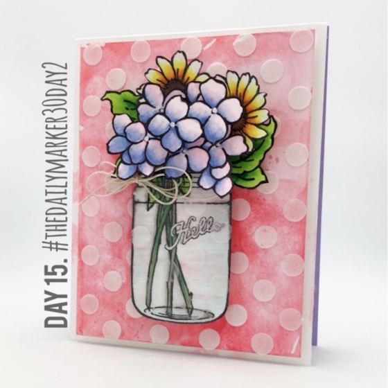
Added a few more flowers, leaves, twine bow, white embossing paste & SSS “Large Dots” stencil. Ahhh I feel better 🙂
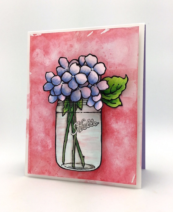
Sometimes it’s nice to have a few blank cards to have on hand plus time didn’t allow for a more involved background. If I wasn’t doing this challenge I would not be posting this card with this background. (sorry just being honest)
I always think of some advice that Jennifer McGuire told me. Something like … if you don’t like a card post it anyway because somebody else might like it. Today I took that advice 🙂
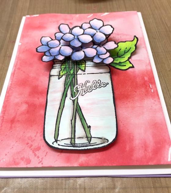
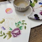
What I wanted to do was stencil a background and have that come through the glass jar. Not a quick idea so I ended up watercoloring this red background. I will sleep on it and possibly deconstruct this card. To be continued ….
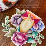
With that said I have been waiting and waiting for this “Build a Bouquet” stamp set from Stampendous. Nobody had it in stock …that is until now. I love that the bloooms are super easy to color and I will be using some Zig markers on the blooms next time. But, the coolest thing about this stamp is the die cuts AND THIS. You can pop up the flowers on the inside of your card or create an easel card! Super duper cool. I can not wait do give it a whirl!
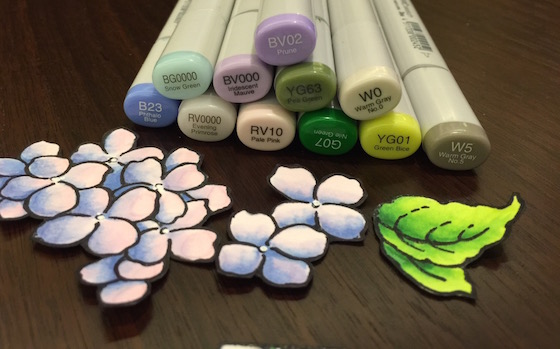
To color the hydrangeas I used my copic color chart from yesterday as a spring board.
This week I will have a video and a giveaway so stay tuned. Have a great day and I am always grateful for your visit. Hugs, Kathy
P.S. Go here to read more about the 30 Day Coloring Challenge and if you want to share what your creating go to Day 1 and scroll to the bottom of the post. You will find a blue Inlinkz tab to link up your coloring.
SUPPLIES AND LINKS :


 DAY 12. Bird with pencils & markers
 Day 22. Gallie update
 blog hop and prizes
Well I can’t wait to see if and how you deconstruct this. I think you are right a little something would look good showing through the jar. The build a bloom set looks really great the hydrangeas are very pretty.
I love what you have done, but it comes down to you are the one who has to look at it and be happy. can’t wait to see how you can improve on something that already looks wonderful. I have bought this set as well and have been having some fabulous fun with it. BUT I left it at my parents along with my paints so have to wait till I go back later this week to keep going with it. Love the fact you can do bits and if your not happy can start again on the piece you are working on. Half way there -wahooooooo
I am so impressed with how much you accomplish each of these 30 days! Love the bouquet!
Hi Kathy, I do like the way it has turned out, and the hydrangeas cut out are very pretty in the jar, Cheers Anna.
I love this card and all your cards love the way you colored the flowers
The red color is gorgeous and I love the texture of the background. It makes the jar full of hydrangeas pop. I think it is a beautiful card just the way it is.
This turned out so well. Love the bouquet.
stunning colouring…love the softness you created.
This is so very pretty!
Such pretty bouquet! Love what you did with the background! I am inspired by your project to keep on going with a card that I started yesterday but had a little “boo boo” on it. I’ll link up later. Have a great day Kathy!
I like them both, the first has a more artsy feel but I agree the background adds something to make the card pop. Beautiful!
I like both cards….with and without the dots. I feel that I could use them for different occasions. Thanks you for inspiring us every day Kathy! Happy Monday!
Love this card, Kathy! Oh mine, you can certainly “deconstruct” a card with talent. Got to color something today, it will make me feel better. Happy week to you too. Cheers!
I love it!!!
It looks great to me Kathy!
Both cards are so pretty!
What a gorgeous finished card!! The additional elements that you added really make this a stunner! I have been waiting for this stamp and die set also and hope it is in stock the next time I have a few dollars to spend! TFS!
Hi Kathy, I do agree that the orginal card was lacking something. Maybe it would have been enough just to add the extra flowers and leaves and the twine. Or maybe you could have sponged the stencil with a moist cloth for a more muted effect. Ha, it’s so easy to come up with ideas if you’re looking at someone else’s work. 🙂
Still, I do like the outcome, and I loved seeing how you improved upon your own design. I do learn a lot from this. In fact, I should be less afraid to touch my projects when they are (nearly) done. After all, as Jennifer and Kristina have also pointed out: it’s only paper! So play!
Marianne x
I do like your card–but I know how you feel, sometimes my cards don’t look quite like I’m imagining it! But the blessing is, you colored it, you experimented, hopefully you had fun and it’s not rocket science nor brain surgery! When I was working in hospitals, I’d say it was a good day if no one died and I was able to help a few people. Just enjoy the coloring!
How pretty. I love the color combo you used on the hydrangeas.
Loved this so much that I just bought the stamp set from SSS, the DIES are sold out, but I am NOT on the list to BE notified when back!
Thanks Kathy for another amazing COLORING Lesson…love this whole idea!
Hugs…..
LISA
Good advice today. It’s always so nice to see a beautiful card become transformed into one even more lovely. Thank you for the lesson today.
Once again, lovely! I’ve got that set on my wishlist, too. Love what you did with it!
card # 2 is a great deal better! I love that stamp set.
Love the cards. I love the simple touches you added to take the card to the next level. I have this stamp set. Love it, but I’ve been afraid to color the hydrangeas. How did you use all of those colors so beautifully????
Hi Kathy, That has improved it your the back ground and by adding those 2 other flowers has brightened it up quite a bit, Cheers Anna.
Beautiful as usual Kathy but if your not happy with it that’s all that counts thanks for sharing the struggles that many of us have
Love how you rearranged your bouquet! And the dots of course – dots are always a good thing!
Very nice card Kathy. I think your background looks great. Thanks for sharing with us.
When I first read about deconcstructing the card I really wondered what was to come… the sunflowers are a gorgeous addition to an already beautiful card!
Cute cute cards! Thanks for sharing the techniques! I like the first card the best!
Beautiful card … AS USUAL!
I love both cards, but I have to say the second card is my fav. Thanks for sharing your beautiful talent!
Love the added polka dots! Perfect.
I totally understand how you feel. I sometimes have to walk away from my projects and visit them later to get the final project the way I like. Mostly it’s because I’m so tired I can’t think anymore, lol.
gorgeous card love the white dots!
I have that (it just needs something else) felling often! And I have learned to set is aside and come back later. I rarely toss a single thing! But rather put it in my problems bucket. LOL And when I come back later and rumage through it, I say to myself, this isn’t as bad as I thought it was in the heat of the moment. Thanks for all of your inspiration, Kathy!
Gorgeous!
I see what you’re saying. I like the first card but the second card really pops and has a wow factor! I have this set and have yet to use it. Maybe I should give it a whirl before this challenge is over.
I was away for a few days and just saw your card. How beautiful. I love this stamp and die set. And I love the pop up die as well. Your coloring of the flowers is great and I love the Mason Jar…..cute card. TFS
I love the chance of rain card mainly because of the background. I love the mix of blues
Oh look how fantastic it looks now. Love the “makeover”. What a difference the stenciling made.
I REALLY LIKED THE STORMY WEATHER CARD! I WORK AND WORK AND I STILL CAN NOT COLOR AS WELL AS YOU! MAYBE. SOME DAY
Okay. I really did love your original card but when I saw the reconstructed version I said “WOW!” Love the added stenciling and flowers. You were right! Glad you are feeling better now.
Thank you for posting both cards, the first one was pretty but the second one was WOW! Love the additions, made it a totally new card!
I love all your cards!
The 100% Chance of Happiness card is so creative!! Thank you for the chance to win!
I love both your cards and find them both to be so fantastic!! Your coloring and your artistic touch speaks for itself and lends beauty to any project!! I think you are so amazingly talented and I LOVE the tips and hints you share!! You are fabulous!!
Saw this post after you deconstructed it. Both of them were pretty in there own way but those polka dots definitely gave it a new angle 😉
Oh wow, so pretty and feminine!!!
Kathy, these are both gorgeous! I really love the pink/red background! Stunning cards!
LOVE IT just as it is Kathy, especially with the striking red background – I would never have thought of that!!!
LOVE how the dies cut right to the edge of these stamps too 🙂
Gorgeous card,wonderful colouring and colours.
My darling husband always tells me, “sleep on it and see what happens in the morning”. I guess you have proven him correct. Just beautiful. Thanks Kathy.