Hello Friends, How is your weekend going? These past few days have been a struggle for me to spend the time I need to on my posts and content …. and that really bugs me. Sorry 🙁
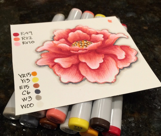
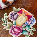
It’s a family kinda weekend and that means another short post. I did have time to color this super jumbo flower. It’s a great one to practice some “no line”coloring. First I stamped it with some pink distress ink.
Most likely I will end up cutting this out.
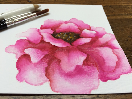
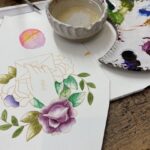
I watercolored this flower above in the last 30 day challenge. You can see the full post here. Which one do you like better? I think I like the dark center better? Actually I really like the old one better 🙁
Have a great Sunday and hope it’s full of something good. Hugs, Kathy
P.S. Go here to read more about the 30 Day Coloring Challenge and if you want to share what your creating go to Day 1 and scroll to the bottom of the post. You will find a blue Inlinkz tab to link up your coloring.
P.S.S. If you are having trouble sharing your art on the Inlinkz tool here is a tutorial. If you want to share on Instagram even better (but, only choose one please) Here is a tutorial. I hope you find these helpful ![]()
 what to do with those smudges
 Penny Black’s “A Touch of Whimsy”
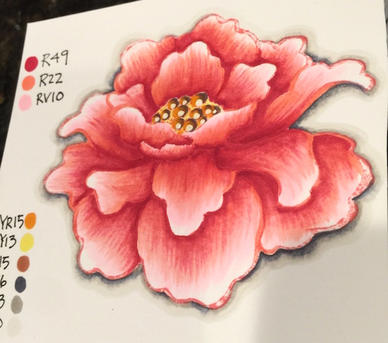
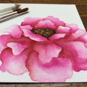 Day 28. Feeling Rosey
Looks lovely! I’ve never tried no-line colouring, but the more I see this technique the more I am wowed by it 😉 Thanks for the inspiration, hope the rest of your weekend is a good one, Rx
Simply gorgeous! I love the second one you did in the last color challenge! I LOVE the colors! This flower image is beautiful!
I love both, I really couldn’t choose. Maybe make a car with both then we can see 🙂 I’m enjoying whatever you can post. Must say I miss seeing whats gone to instagram as I dont do that so feel like I’m missing out on seeing things 🙁 But I can certainly understand you not having to go to links twice if posted at both so just ignore me.
Aileen, Usually Instagram for my posts are a sneak peak to what will be on my blog so don’t fret you missing out. But you are missing out what other people are doing. Just something to consider. Have fun doing for you! 🙂
What a gorgeous flower!! I am such a failure at no-line coloring!! Gotta keep practicing!! I think I like the one colored with copics better!! Love all the details that you can see in that image!
Beautiful flower. I do like the darker center (2nd flower), but I really like the petal color on your first flower. Have a wonderful family day.
Hi Kathy, I love both of the flowers, you do such a great job with the no lines painting,
would love to see a card made with them, Cheers Anna.
Actually, I love both versions. I suppose it all depends on how you want to use the flower in you final design. The fist one has a wonderful graphic look, while the water coloured one is more free flowing.
Have a wonderful Sunday, Kathy!
Marianne x
so pretty.. Good job.
I like them both and the dimension you gave the first one in the center in particular… looks like little craters! Also, I agree with Marianne that it all depends on how you want to use it/them in the end. Enjoy your weekend!
Both are beautiful. I love the colors of the flower on the first and love the center on the second 🙂
Well Kathy it’s been a great Month comitting to take the time to color. I find that some things around the house are neglectd now! Like the floors and the dusting! And exercise, wow I’ve barely steped foot into a sneaker this Month! But! On the bright side my watercoloring is improving! Cheers!
Patti,
The best thing about this past month is you made time for you. The bonus was your watercoloring skills. I don’t see any dust bunnies. 🙂
BOTH ARE FABULOUS, Kathy! It just depends on your taste at the moment, I think! THEY’RE BOTH GREAT!!!!!!!!!! 😉 TOTALLY UNDERSTAND about a short post! Mom’s are usually running around making Dad’s Day SPECIAL today! 😉 (((HUGS!!!)))
I like both of them. Each has it’s own merits. That being said, I really love the one colored in copies. I love the detail in the individual petals. I appreciate all you have to do on these 30 day challenges. It must be really hard to have to color and post every day no matter what is going on around you. Thank you so much for your dedication you show to us, your followers.
Bonnie,
Thanks for the kudos. All women are multi taskers and that’s why we need to find time for ourselves. This challenge is for you. 🙂
I like the watercolored one best, probably because I can’t do that as well as you LOL! And, I’m sure this gets exhausting for you trying to give your encouragement to each one of us. You need a ghost writer to help you out when you do these challenges HAHA! Hugs, and try to enjoy 🙂
Do I have to choose between them? I like them both for different reasons. Love the contrast the dark center provides but I love the detail on the most current one. Can’t decide, which isn’t unusual for me.
I like the older one as well.The older one looks more realistic . Beautiful Blessed Day.
Hi Kathy. I’m new to card making. I really love the way you color your flowers. I need to practice more. Thanks for your sharing.
Your coloring is stunning in both examples. I like the Copic colored flower better because it is more detailed.
Love the second one best
Both beautiful, I personally like the second one more!
Hi Kathy, A special thankful for this weekend’s posts as family needs to come first!! I am reading your posts daily and watching these great techniques with a lot of interest. I am struggling with no line coloring with my Copics but know I need to practice more. I also just ordered the new Zig watercolor pens and am anxiously awaiting to play with them. Both of your flowers are beautiful but I like the second one the best. As always, thanks for all the work you do for us.
Cheryl,
You are going to have so much fun with the ZIG. I love them!!! Always keep in mind practicing should be relaxing. You are making time for you. We are always doing for others. 🙂
I think I like the new one best!! Both are gorgeous though!! I always forget about the no line coloring technique when I am in my Craft Oasis! Going to have to remember it tomorrow when I am in there!! TFS!
I love them both, gorgeous color work!
Both cards are gorgeous, Kathy…WOW! I think I prefer the one done with Copics and the light center, but they are both so pretty!
Hope you’re having a nice weekend with your family 🙂
I think that they are both pretty, but I favor warmer pinks, so the Copic one is my favorite. I also am getting more of a sense of depth with the Copic one.
Kathy everyone knows how hard it can be to tune out the world and get time to color. You really have done a beautiful job on both of your flowers , thank you for inspiring us all to be still and color
This is very pretty! Thank you for taking time away from your family to share your talent with us Kathy! You are appreciated! HUGS!!!
These are both so gorgeous! You have been so inspirational to get me coloring, thank you for creating this challenge.
Kathy, they both look great but I do like the recent one better. Guess I’m partial to the lighter tones 😀 Hope you had a fantastic weekend as well.
Both flowers are gorgeous Kathy. I do like the dark center but I love the pink on your first flower.
Hi, I Love both, if I had to pick I would say the dark center is my FAV. Thanks have a Fab weekend. hugs. Happy coloring.
Well, I like them both. Beautiful coloring, as always. 😀
Totally gorgeous and I so want to try this technique…..next on the list I think. I am really enjoying these posts Kathy. Thanks so much.
Ohhh these are both beautifully colored images- truth be told, I probably would have never given this stamp a second look (the face image kinda freaks me out), but after seeing you use the flower, I might be swayed to purchase it (and give the face image to someone else? LOL!). That being said, I’m leaning toward the watercolor image- it is so beautifully done! I’ve only tried water coloring a few times, not sure if I’ve got the flair for it, but like anything- practice makes perfect!)
PS- I am soooo enjoying this 30 day challenge!)
Both are absolutely stunning!
Beautiful cards. I like both of them but I agree with you, I think I like the dark center the best. I am partial to the more pink colors as well. You did a wonderful job on both however. Hope I can do that well when I try this technique. TFS
BOTH are gorgeous but I actually like the newer one better. 😀 Those colors look so velvety and soft and elegant and rich. LOVE!!
I love them both but for different reasons so I can’t pick which one I love the best. The colors are amazing but then I am a sucker for color. That’s why I love this time of year. The grass is so green, the flowers are so colorful, the world looks beautiful! Hey, just like your flowers! What is no line coloring exactly? I’m thinking I do that a lot!
BOTH flowers are GORGEOUS!!!
I LOVE the 1st one, with the lighter centre – it is an ABSOLUTE DELIGHT!!!
ANOTHER technique I look forward to trying 🙂
Wow! These are lovely. I prefer the first card.
Aww, such a pretty image and sooo beautifully coloured.
GORGEOUS and you are a rock star colorist!! Great job on both blooms – there is something to love in both of them!!
They are both beautiful! Thanks for sharing your talents and your time.
Crafty hugs,
Dawn
DesignsByDragonfly.blogspot
Wow you make it seem so easy to do these. This one was a challenge for me during the first set and still is a challenge during this 30 day’s. Maybe by the next 30 day challenge I might have this one down. lol