Hello Friends, I hope your week is off to a good start! Today I have a card makeover for you with a beautiful Power Poppy image.
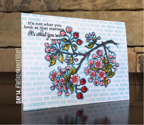
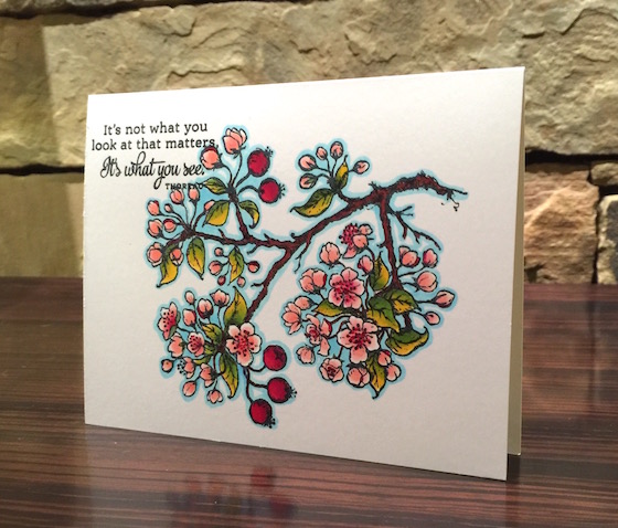
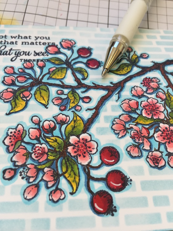
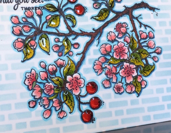
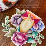
This photo is the result of the makeover and I am happy with the results. I colored this last week and for some reason I wasn’t ready to share it because it needed something else…..A MAKEOVER!
It’s such a beautiful image I wanted to give it more love when I had some spare time so I tossed it aside.
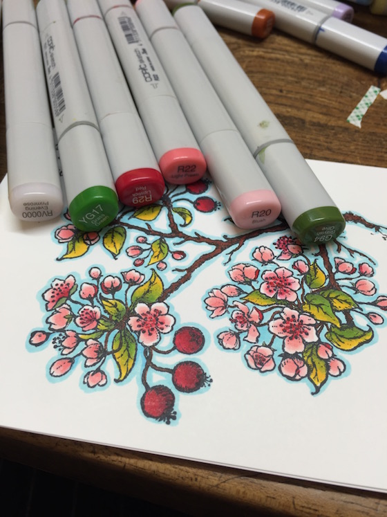
I have been outlining my images with a blue marker (Boo or Booo) for years. Love how it makes things pop. As you can see I didn’t use many colors and so my coloring came together without spending a lot of time.
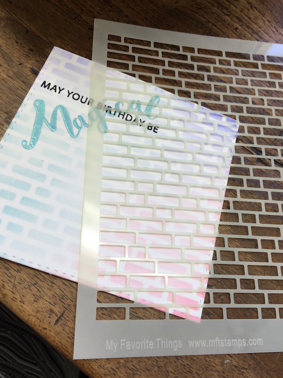
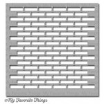
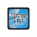
You might recognize this stencil because I used it yesterday. Sometimes if you clean up to quick …like it’s ok to have some Sh*t laying around… some happy accidents might not happen otherwise lol. Because my stencil was right there I grabbed some salty ocean distress ink with a dauber to put a light layer of ink around the image. I wasn’t super worried if it went on the flowers because if you have a light hand it usually works out fine.
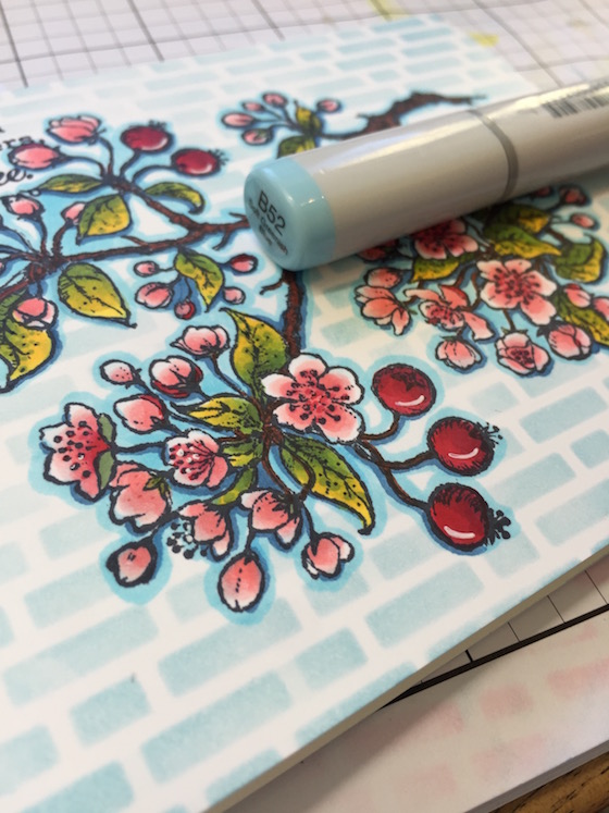
I like how the rectangles looked behind the soft round flowers. I wanted to add a little more depth to image so I grabbed a blue (B52) and added a line around the bottom portion only of each flower, bloom and branch.
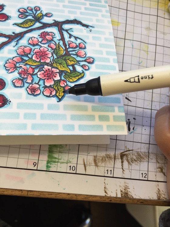
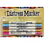
I love the small tip end of the distress markers because it’s great for adding microscopic dots to leaves and such. In this case I added navy to my green leaves. (my brown was dry)
A line was added to the red berries with a white gel pen and a few of the flower centers (I stopped that cause there were to many flowers). By the way I don’t store my white gel pen in any particular way.
Glossy Accents were added to all of the leaves and the red berries. Be careful when adding glossy on top of a white gel pen. It can smear.
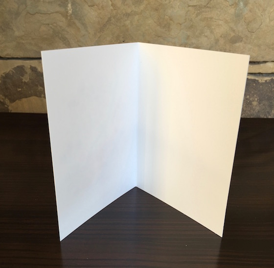
When making holiday cards these top folded cards are #120 and perfect for coloring with alcohol markers. They not only save you time but, THEY DON’T SHOW the copic coloring on the inside. (Now if you have a heavy hand and really saturate your images you might get a little bit of a shadow?)
On another note I wanted to say thanks for all of the comments on my blog. I wish I had time to say thanks to each one of you individually. Those of you who are uploading on my blog… hang tight eventually I will stop by and leave a little love. Thanks to you all for the support by participating, or leaving comments or spreading the word! You guys rock!!!
See you tomorrow 🙂 Hugs, Kathy
P.S. TO LINK UP & share your coloring click here and go to the bottom of the post. In case you missed it you can read all about the 30 Day Coloring Challenge here.
P.S.S.If you wan to see what everyone is submitting for The Daily Marker 30 Day. Click here to see what is being shared on my blog but, you need to scroll to the bottom of the post. You can click here too to see everything under the hashtag #thedailymarker3day3 that’s on Instagram.
Today’s Card Supplies & Links: Click on the thumbnail to go to a store. Affiliate linking might be used depending on the product


 Dat 21. It’s All About You + Winners
 It’s a wrap with video
 DAY 6. ORANGE You Great!
Amazing what that background does for the image. This is stunning! ♥
Beatuful results.
Always a beautiful card. I am slowly getting back into my crafting and believe me loving it. I will have to try this. Thanks again Kathy for sharing your time and talent with all of us.
Wow, such a transformation. Lovely!
WOW – I think it looks lovely before your makeover and gorgeous after!!!
You are SO BRAVE challenging yourself to add colour to the background like this after all your detailed colouring!!! LOVE the extra details and accents you have included too … might have to go back over some of my images to add some awesomeness before they get turned in to cards – THANK YOU for the INSPIRATION 🙂
gorgeous
Oh man!! I love the addition of the stencil! I so have the perfect card for this technique….I’m giving it a whirl Kathy! TFS
Gorgeous design.. I love the bricks! You could SO totally enter this in the Color Throwdown challenge today! 🙂
gorgeous..great paper that it doesn’t bleed through..that is the only down side on using Copics..with the papers i have…
You make me laugh at some of the things you say …. love your candor. The card is really pretty. I have that stencil and the MFT larger brick one….I’ve used them a lot and love your take on the stencil and the two colors. Note to self, again.
I have gotten to be in my craft room more this week and it always feels good to create something. Hope to be in there a few hours today, too. My goal is always to create something every day….don’t always reach the goal, but I try.
Have a good one and thanks for the post today.
Kathy, your card was beautiful before, but there is something about those light blue bricks that really makes it gorgeous! Your work is always outstanding!
Such a beautiful card Kathy!! Thanks for sharing.
What a gorgeous card and image, Kathy, and I love the makeover – it’s amazing with the stencil and your added sponging and Copic outlining! Stunning!
I thought it was lovely before but you always find something extra to make them pop!
You teach me so much!! Thank you and loved your beautiful card and demonstration!!
This is a beautiful card! What ink did you use to stamp the image?
Turned out great. Beautiful card.
Wonderful “makeover”, Kathy, the additional touches you added took a beautiful image and turned it into an exceptionally beautiful card!!
Wow what detal on a one layer card! Thanks for the tips! I need a stencil!!
Wow! I can’t believe the difference, such a lovely background and it really finishes the card off nicely, along with the added details! 🙂
Beautiful Kathy,and you are soooo right about the gel pen smearing..learned that the hard way. I like the definition with the darker blue,that really changes the look .Thank you for teaching Sooo many techniques
Love how this turned out, Kathy. I’m finding it hard sometimes to decide if I need to add anything and if yes, what. I usually check with my DH to see if he likes it at is and he gives me his honest opinion, which is often helpful. My biggest fear is always ruining what I’ve got, since colouring on my cards is still hard work.
Marianne x
Love this card Kathy. I’m going to leave some sh*t on my desk and see what happy accidents I come across. LOL.
Very beautiful–love the bricks behind the flowers. Thanks for all of your lovely comments on my coloring!
I really like the brick background, but then I’m allergic to white space.
Wow, the background makes such a difference! Beautiful!
What a beautiful finished result!! I have been out sick since Sunday and even though I have been getting into my craft room each day for a few minutes I haven’t posted anything yet. Hoping to be able to get around to it by the weekend!! TFS
One word — AMAZING! What a fabulous one layer card that has built in dimension! I am going to give this tutorial a try for sure!
Very beautiful card!! Love the stamp you have used. This is the kind of stamps that I love the most. I’ll have to check them out. Beautiful background.
-Berina
Moxie Craftie
Love both !!
Ps see you next week. ..♥
yay!!! Excited to meet you 🙂
I’ll email you my cell number for texts etc..
Such a pretty card.
Goodness, what a difference that background makes! Bravo! Jo x
Love your makeover, really adds alot ! I love all the extra touches you add 🙂
amazing makeover! just a gorgeous card!
I actually love both looks but seeing another take on a stamp is inspiring, especially #MarcellaHawley and her ever so detailed #PowerPoppy stamps!
I loved the first card but I agree with you that the make over is just a touch better. The rectangles behind the flowers….makes the flowers really pop! Nice job..great design. TFS
What a great make over. 🙂
Beautiful card, as always. I like both, really.. The before, and after, are both spectacular.
Your coloring is really awesome, Kathy! Love the beautiful floral card>
I love both cards actually!
Just delightful. Love that quote.
Your make over made a beautiful car even more beautiful! Thanks for sharing your tips so add details. TFS
Wow, amazing what a difference a little love makes isn’t it? True in most endeavors in life not just crafts. But you did a lot more than just add the background “bricks”. But it truly made this card shine!
Gorgeous!!! Thank you for sharing and all tips. 😀
Loved all the cards… beautiful coloring.
Great cards! I love your watercolored background scene – DON’T ever say you aren’t an artist, because you are! I also loved the colors you chose for the 2nd card – non-traditional but gorgeous. Thank you for sharing all three cards.
Your watercoloring is spectacular!
Love this card and thank you for the chance to win
what sensational cards!! The tiny Tinseltown’s is absolutely adorable made even more magical by your coloring! Such fun! TFS ❤️
Loooooooove it!
You are right this finished off the card! It’s so pretty! I don’t have copics because of the cost but I look forward to the day that I get to add them to my craft room!
It looked beautiful before the background and now its totally gorgeous. Such a pretty image too.
Love how this turned out!! I have many cards that I need to revisit.