Hello Friends, How are you? It looks like so many of you are finding some “you” time … that makes me so happy and I feel so inspired when I see what you all are coloring. Thank YOU!
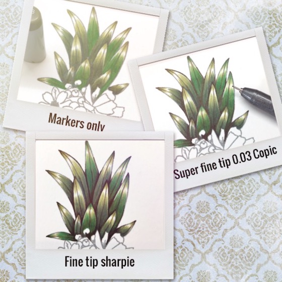
My goal is to impress upon you what a difference adding a little black to those nooks and crannies can do to enhance your coloring.
I hope you can see the slide show below … showing the process a bit?
Pineapple Perfection is a stamp that I have been itching to color since I first saw it and today I had a little time to color half of it. Woo Hoo
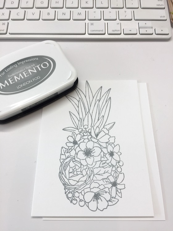
Tomorrow hopefully I will be able to finish coloring this beautiful stamp. I stamped the pineapple with some grey memento ink.
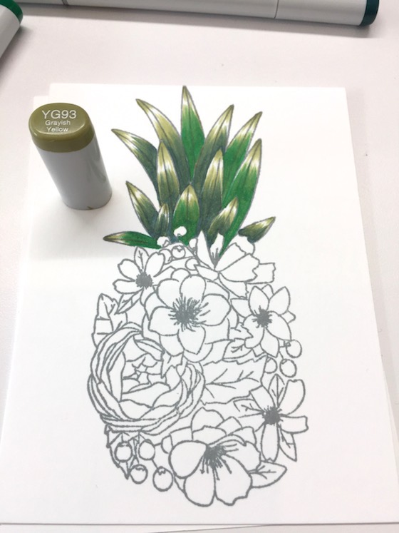
One of the tips that I talk about on The Coloring Challenge Road Trip is how filling in the nooks and crannies really makes your coloring POP. Hopefully I can convince you to try it if you haven’t already?
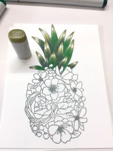
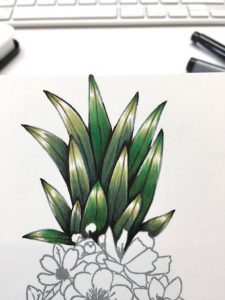
Lately I have been using a combination of super fine tip 0.03 and a fine tip sharpie.
If you are from Texas, Florida or the islands please let me know I would love to hear how you are. See you all tomorrow. Hugs, Kathy
P.S. If you want to see what everyone sharing on Instagram click here … If you want to see what everyone is sharing on my blog click here and scroll down.
P.S.S. If you are new to the challenge …. The premise of “The Daily Marker 30 Day Coloring Challenge” is to color something everyday even if it’s for five minutes. (However feel free to jump in or out as time permits). Any coloring medium is welcomed. Click here for DAY 1. TO UPLOAD YOUR COLORING or here on Instagramor here on Facebook (FB is a closed group). Please remember to use the hashtag #thedailymarker30day kids & young adults #thedailymarker30daykids
If you have any questions about “The Daily Marker 30 Day Coloring Challenge” you can refer to this post. If you want more info on The Coloring Challenge Road Trip click here.
Card Supplies & Links: Depending on the product affiliate links may be used at no cost to you.




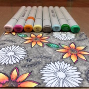 Day 19. let’s see where this goes
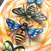 Day 25. Big & Bold Wings & Bees-Colorado Craft Co.
 giveaway…this sweet awesome elf


oh wow!
its amazing!
Wow, what a huge difference! Lovely. And looking forward to the finished piece.
(I am in So. Florida, East coast. Roof leak. But my whole family is well! Loss of power just restored last night. Woo-hoo! lol Thank you for asking!! Now I can get back to my routine and color more!). Have a happy day!
I’m so glad everyone is safe, Becca! Sorry about the roof – bummer.
Wow, Kathy!! Thanks for taking the time to illustrate and show the differences between the three. I’m going to outline my next coloring attempt & see how it goes. Can’t wait to see the rest of the image when you finish coloring it!
Wow….adding black in books n craines adds lots of depth to the image and brings it to life! Looking forward to completed piece 🙂
After watching some of your videos I tried this technique on an image I had colored that looked very flat. I was amazed at the difference it made!
OMG yay Brandy I love hearing that!! Thanks for trusting in me 🙂
You have me hooked on dots and I trust your talent. So I will definitely give the black a try. This stamp from Concord & Ninth is so delicious. Got to check that out…. till tomorrow.
Concord 9th…Concord 9th…Amazing stamps
Thank you for sharing the different looks!!
Great tip, and that does make a huge difference, everything POPS just that much more!!
Wow! Yes, I am definitely going to be trying this technique! It is amazing what a little bit of darkness can do to really make the piece pop! TFS!
That’s a really pretty stamp!
I’ve done it and I’ll do it again – it is amazing!!! Honestly, it really does make your colouring stand out that little bit more. Thank you for continuing to inspire. xx
Wow, I had no idea what a difference the black would make. Thanks for the tip!
That’s a big difference, thats something I get to use for sure. Thanks for a great tip.
I am curious how the whole image would be as you can finish it tomorow, hardley can’t wait!
Wow–amazing! Love the music and INFO from your slide show. Also making a base layer of blue seemed to make a huge difference, I need to do that more with leaves. Thanks for helping us make our coloring more interesting!
Thanks for sharing how to make our coloring pop.
The outlines are “wow” and make the highlighting so impressive!
Hi Kathy.We made it through the hurricane.OMG,scary.had some damage but fixed it all and cleaned up.I feel so very blessed.We got power back last night.Still out of cable an internet but hey! Power is golden I don’t care about cable & the other.My heart is broken for friends and strangers who are so much less fortunate.Weve been running candles ,flashlights,and food & water to help others.Great to see some art for a minute.Hugs
Oh Valerie I’m so glad you and your family are safe. What a kind and generous soul that your helping those less fortunate. We need more people in this world like you!
Great technique Kathy! I wish I trusted my hand to retrace lines on my images but I’ve messed up way too many beautifully colored cards to do that again. LOL
I am always impressed by your extras, even though I am still working on the ” greens” level! I too have loved this stamp since the first time I saw it! I am not big on pineapple images, but i love florals. This one is both lovely and unexpected. I would love to color it too. Can’t wait to see it finished, even if you take a week to do it! I would love to hear your perspective sometime on the ups and downs of having coloring become your job.
You certainly have the nac Kathy! It pops with the black detail. AND, you made me pop too with your “cool” video music. LOL
Wow it really makes a difference. That is what I love when I see your images is those details. That that makes your images come more to life than usual.
Amazing the difference the black makes! I’m in Central Fl and N. GA and got extremely lucky in BOTH places. My heart aches for those who weren’t so lucky.
I’m so hppy to hear you’re safe, Rufus!
Kathy, you are not kidding about the depth the black give in the nooks & crannies. This is fantastic. Looking forward to seeing it finished now. (Something for me to try working on, getting depth in my colouring.) Lovely work as always!
Kathy, This is amazing. I have to admit this is one of my favorite stamp sets released in the last few months. I am hoping to get it purchased before it is no more. That past week I have looked forward to your posts and all the #thedailymarker30 posts on Instagram. I so dislike being down and not able to color or craft in some way other than in my head. I look forward to applying these tips soon.
I am so happy that you are enjoying the challenge, Roberta! It brings me happiness to look at the #thedailymarker30day, too!!!
I absolutely adore this image and you’ve brought it to life in a spectacular way! Love your creative style of bold colors!
WOW – it is AMAZING the difference a touch of black makes!
I confess that I am getting braver and going darker with my Copic markers, feeling ready to go to the next step and reach for the black … or maybe C9 & T9 🙂
Yay! I love hearing this! Tried the nice cold and dark colors! You will be surprised how much depth it will add!
Very cool way to create a wow factor.