Helllooo Friends, How was your weekend? Did it feel good to get some coloring in and find some “you” time? I hope so! At the end of The 30 Day Coloring Challenge I always hear that so many of you have seen your coloring improve. That’s the icing on the cake! Be patient with yourself and ONLY compare your work to yourself. As the month ticks on watch your coloring change.
If you are going to find that magical 10 minutes or a bit more you most likely won’t be able to finish what you set out to color and that’s a-ok! I recommend that.
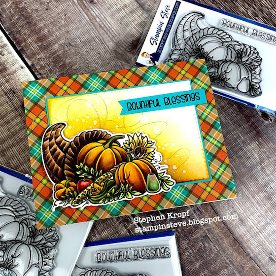
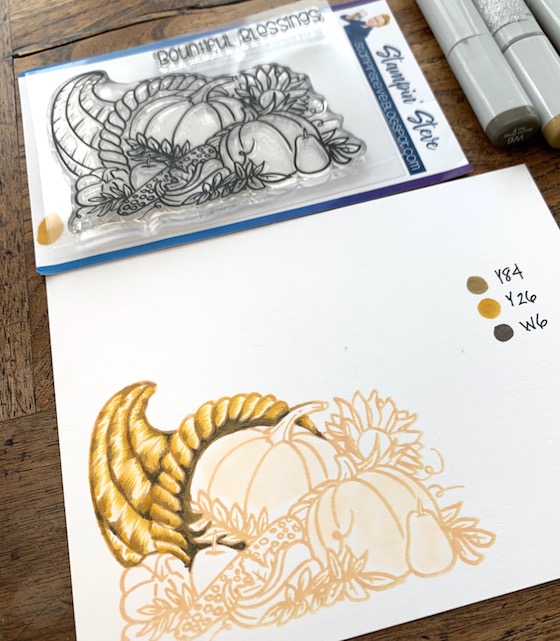
This beautiful and festive stamp set is designed by a friend of mine, Stephen and he is one of the most amazing colorists and a pretty great guy too! He colored that card above and it’s pretty unreal isn’t it! If you want to check out his blog or stamp click here.
Coloring with lines can yield a neat result and I find it very satisfying ONLY IF IT’S WITH A VERY SHARP PENCIL! In the photo above I have a first layer of color with some Copic markers.
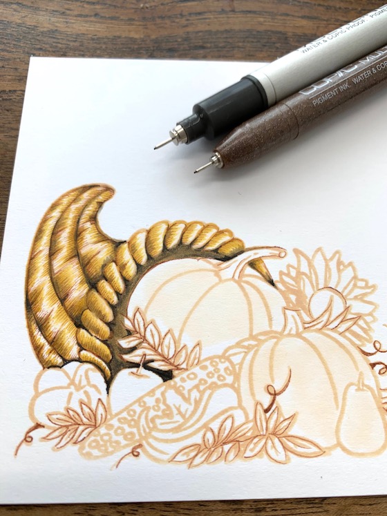
In this photo I used a sepia copic marker .3 to trace the lines of the image and to draw many tiny lines in each section of the “basket” or cornucopia. I used a Copic 0.03 to add a few detail lines but, not as many as the sepia marker.
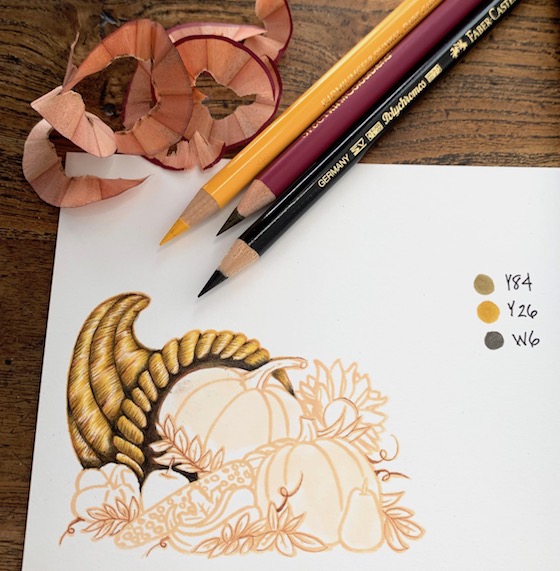
In this photo I added colored pencil lines in each section. It’s pretty essential to continue sharpening your pencil to get a nice and super fine line. If you relax your hand and have a light grip the pencil tip won’t break.
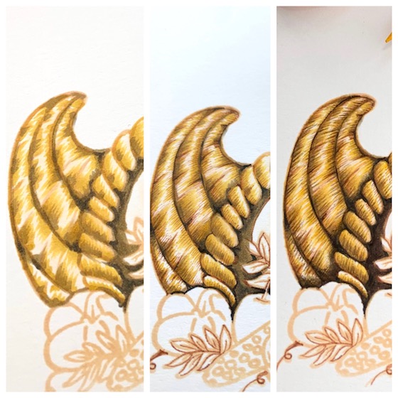
My goal was for this to resemble a straw basket. Looking at the side by side you can see how drawing lines can give your project a nice textural look.
Thank you for your visit today and I will be back tomorrow. Hugs, Kathy
P.S. There are 3 ways to share what you are coloring. If you want to join a community of coloring enthusiasts I recommend Instagram or FaceBook . Be sure to tag me and use the hashtag #thedailymarker30day. Kids & young adults use #thedailymarker30daykids.
To share you coloring ON MY BLOG click here to link up.
P.S.S. If you have any questions about the coloring challenge you can refer to this post . If you want to get my posts in your mailbox you can sign up here or subscribe to my videos here.
 Day 10. Mixed Coloring, Hop & Giveaway
 DAY 28. Poppies & Giveaway
 DAY 1. Copic Coloring and Video


Thank you for reassuring me that just ten minutes is enough even if it’s not done. I also checked out Stephen’s blog and the other project he made with the set looks good.
Wow, stunning coloring (again), I love the highlights next to the lines!!
I also think it’s amazing of you to use smaller company’s stamps for the challenge! I didn’t knew Steven’s stamps until now. 🙂
You are so right with emphasizing again that we should only compare to ourselves! I sadly have seen so many comments lately from people saying that they don´t want to show their art because they think it is not good enough compared to others. I encourage them, but I guess many are just hesitant. So unfortunate! Thank you so much for encouraging people to show their colourations!
Kind regards from stempelfrida
So beautiful !!
Just a note to say that the link to the blog goes to June challenge and not to the first day of november challenge !
What a pretty stamp! I love the depth in your basket and you nailed the straw look. Thanks for your tips on coloring!
Thank you for the progress pics and explanation of adding texture. That’s an area that is particularly weak for me right now. I tend to take the stamped image at face value and not flesh it out more….
Wow..the detailing with line looks.awesome..takes the images to next level.Thanks a lot for sharing this with us.
I appreciate the tips you share in your posts. In 10 minutes, one can certainly practice coloring with sharp pencils and making the lines over copic like you did. And repeating those every day is really what helps us grow!
Fabulous!
Wonderful coloring!
The cornucopia basket looks almost real. Great job of coloring. I’m amazed at how sharp your pencils are. How do you get that needle-like point? I’m so careful with my pencils, but they seem to break off if I try to sharpen too much. Oh well. I’m just enjoying the color challenge again. Thanks so much.
Wow! The texture in the basket is amazing!
Fabulous texture, beautiful basket!
Oh wow!!! Stephen’s stamp set and card are amazing!
But your “simple” colouring is totally stunning!!! Great technique!!!
Wow!!! I love all the texture this creates!!!! Beautiful!!!
I love when you do the side by side comparisons. It is so much easier to see the progressions and the difference the layers make.
Awesome shading, thanks for the side by side photos!
Kathy, the link above to your linkup on your blog goes to JUNE 15, 2019 post.
Such tiny details love the step by step pics and dimensions and depth in the basket! Great tips! Thanks for sharing your precious knowledge!
wow! what a beautiful technique!
What a difference adding the lines makes, such beautiful detail and looks so textured. Thanks for sharing the pics and colors you used.
I LOVE the texture that your pencil lines bring to this basket, Kathy! IT’S BEAUTIFUL!!! I also LOVE the warm glow your friends card has! It is GORGEOUSLY DONE! ;)<3
Absolutely beautiful!
Such gorgeous coloring!!
Such awesome detail just with lines! Never thought of that.
Because of this challenge, I’m making Thanksgiving cards. Now, I usually send out the basics, Birthdays, Births congratulations, Christmas and sometimes Halloween. This is the 1st year I’ll be sending out Thanksgiving cards. Thanks for the inspiration!
Kathy your coloring is so pretty!! Great card!
That is a fantastic final result
Wow! Absolutely fantastic Kathy!
Thanks so much for teaching new techniques!
This is stunning. So much dimension and detail. Love it. I’m 4 for 4 so far. This is fun. Hugz
Beautiful design and card! Thanks for sharing your coloring tips with us!
Such a cool technique!
Live that stamp, you colored it so pretty!
That’s a great technique! Though I think it is a bit too complicated for a beginner like me :)) But I will give it a try!
The image and his coloring are both awesome! Thank you for sharing. And your lines are incredible. I didn’t even know the multiliner came in sepia. That is really beautiful. All my best, Rosy
Wow, this is amazing. Thank you for mentioning that even a little time coloring counts. I only had a small amount of time before bed last night, but I managed to focus on a single flower bud and felt so much better for it.
I have only been crafting for a little over a month (after years of watching in awe the videos of Jennifer McGuire and Kristina Werner), but in the 4 days I have been doing the Coloring challenge I have already seen a massive improvement. I am no longer scared of my pencils and now I see them as a very valuable tool. My goal over the rest of the month is to explore as many mediums as I can, next on my list is Watercolors.
Good for you! Looking forward to hearing what you think about watercolors 🙂
Love the stamp that Steve designed! I think part of my coloring problem may be that my pencils aren’t sharp enough. Will play around with that!
What fun, learning something new. I never thought of coloring this way. Thank you Kathy.
What amazing texture you have achieved with this technique! Just beautiful!
Very nice stamp and coloring! I have to purchase a new sharpener—keep your pencils sharp!!!
It’s mesmerizing!! Gorgeous coloring!!
Wowza!!, so beautiful!…love seeing the side-by-side images and really appreciate your tips/tricks..thank you!!
Wow this is beautiful and I love the how you made the straw basket lines! So gorgeous!
Your shading is OUTSTANDING! OMG! GORGEOUS!!!!!!!!!!!!!!!!!
The dark brown in the recessed areas of the basket make all the difference. Thanks for the inspiration.
Truly beautiful Kathy! Thank you for the tips for colored pencils and even coloring for 10 min. is a wonderful thing!
Awesome-ness!
Oh how beautiful this is… that cornucopia is awesome. Stephen did a wonderful job designing this. I got my Thanksgiving cards finished today. Little bits of coloring on the pies. But mostly stamping so it when pretty fast. I only needed three b’day cards this month so I can get going on my Christmas cards.
That stamp is gorgeous along with his coloring! Your line coloring is amazing, love the texture!
I love the texture you added to the basket…Gorgeous as always Kathy!
Simply gorgeous.
Thanks for showing the side by side view. It’s always nice the see the “difference “ You’re coloring is amazing.
This is so cool! A whole new way of coloring!
The texture you’ve created is amazing! Totally looks like straw!
Perfection! Your coloring is stunning
Your friend has designed a gorgeous stamp!! Coloring with lines is such a unique idea. I am so happy to come across this coloring technique and excited to learn and practice this. I have joined in this 30 days coloring challenge through my instagram handle ‘thespringleaf’ and this challenge is so much fun.
WOW! So realistic look! You did an amazing work, Kathy!
So fantastic work
This is amazing! I love that lines can build to something so magical
Beautiful line work. You’re right we should only compare ourselves to ourselves but I like so many others dont. We see stunning work then feel unable to share our version. Great to have you back in our ear for 30 days.
I absolutely LOVE these color pencil tutorials/tips that you do!! This came out beautifully and I love how wonderfully it came out!
Wow, amazing how much difference the details make! Fabulous colouring! Love your skills!
Wow Kathy, this is awesome. I love how you coloured the basket and your goal to make it look like a straw basket has been achieved completely. Thank you so much for the great side by side photo’s it made it all easier to understand, happy colouring and “see” you tomorrow
The fine lines definitely make a difference. I’ve been breaking my pencil tips a lot lately it seems. Thanks for the tip to be lighter with the pressure. Can’t wait to see the rest of this beautiful image colored.
Wow! I’ve been stamping and coloring for 25 years and it never even occurred to me to use fine pencil lines like this to provide texture and shadow. Mind blown.
Good reminder about simple lines creating immense texture to a picture. As alwsys, beautiful work!
Love the texture, it’s awesome and so realistic.
LOVE how you colored in this cool pumpkin – thanks for the ideas:)
Wow, this is beautiful, Kathy! I love the texture that your pencil lines bring to the basket. Your coloring is AMAZING!!! Thanks so much for the inspiration!
Thanks for the link to Stephen’s site.
Gorgeous. I love the texture on the basket. I have trouble creating depth and shadows.
This is such a cool technique! The girls love to do line coloring but yours is spectacular. Going to check the link for Stephen’s stamp set.
I found that you are right about having a sharp pencil. I just feel like I am constantly sharpening it. Should I be doing that? Maybe I am pressing too hard?? I have been watching so many videos but when it comes down to actually doing it, my mind goes blank! I love coloring but I feel like I’m lost.
I see so many cards or coloring pictures and wonder how they get that look. I forget that just adding color pencils changes your coloring. It is something I must start remembering to do. LOL!
I love how much drama and detail you have in your coloring. I’m practicing but not there yet. I don’t know if I have the same patience as you! Lol
Learning colouring techniques all the time even in my 60s…. Stephens card is amazing…wow wow wow…. love the startings of your image too Kathy, seems I’ll be making more pencil strokes on my images, it really gives a lift and real depth… happy colouring Robyn
I love no line coloring. Your finished card is just beautiful. The no line coloring really makes the image seem so real. Thanks for sharing.
That’s really an interesting technique….using just lines. I’m not sure I have that kind of patience, though…. I do love the stamp.
I don’t know if I’ve ever just taken 10 min. Once I start, time simply slips away from me.
You definitely gave the cornucopia a basket-weave effect. Lovely!
Your pencil details really make the whole image so life-like!
The detail on the cornucopia is so amazing! I don’t know if I have the patience to make so many little lines, but it sure makes a difference, it’s gorgeous!
Beautiful card. 🙂 Love the coloring tips.
Sometimes I feel I dont have time to craft but your 20 minute goal is very attainable. Beautiful image and love the final look on Steve’s card.
Your basket really does look like one of straw. Thanks for sharing your process pics to show each step , it’s like magic!
Wow, I love the lines in the basket! I can actually see how you did it. I am going to try that on something but I don’t know what. I’ve seen it, but never got how it worked. Now I do & thank you for showing us that you can do this. I clicked on the link & I do remember him from Stamping Bella. It’s rare that you see a guy stamping & creating & that’s cool! I love that stamp too! I love what you do with your site. It is so cool & I thank you for doing this for us. Now that I see you have a P.O. Box I am going to mail you the card I made for you but it got sent back to me & I can send you a Christmas card.
Love the shading. It adds much more reality to the image.
What an awesome technique! I’ll have to try it!
I always love the way you take a plain image and then just bring it to life with color!
This butterfly is amazing. I keep seeing more and more details each time I look at it..and it gets better and better! Safe travels to you Kathy
I would of never thought to add lines to create texture. I love the look!!
Absolutely amazing!
Xoxo Olga
What a beautiful job you did coloring this butterfly! TFS
Oh my!! I’m so jealous of your coloring skills!! I can never get that patience to learn and try!!
Dear Kathy
Your coloring skills are amazing and thanks for the tip on sharpening the pencils and getting a light grip. Thanks for introducing your friend too. he is so talented. Thanks for teh Challenge. I am no longer scraed of colorfing and i want to improve day by day. Loev you loads, tc May you and your family be blessed always
Wow, I love the way you added the lines with your copic pens. Very cool idea!
Gorgeous card — so realistic.
WOWZA!! That is gorgeous!! I remember doing a drawing in college with shading with just lines. It took FOREVER!!! Not sure I would have the patience but it looks STUNNING!
Your coloring is awesome Kathy! This challenge has made me so much confident of my coloring! ❤
Amazing as always, Kathy! Love that line technique…gotta give it a go!!❤️
I love how you explain things in detail and how to achieve the desired result.
Ooops, I commented on the wrong post with my earlier comment..eek! This cornucopia is so realistic that I can practically feel the roughness!
It was the one most outstanding colouring u did… PerfectNess in ur hands… The way u shaded it’s colour & the final outcome is just mindblowing…
This is fabulous, fantastic coloring!
A great start and thanks for the reminder that I don’t need to finish the colouring project that I start. It’s all about setting aside a little time to colour. I need to remember that.
Yes! It took me awhile not to grip tight and use a lighter stroke. It was no wonder I was breaking the tips of my color pencils all the time! Your coloring is amazing!
so wonderful!
What a fab image – great colouring tips 🙂
So thankful for your inspiration Kathy !!!!!!! XO
Gorgeous!! Your coloring on this is so bold! Love the plaid background!
WONDERFUL way to add detail, texture and dimension!
I’m only catching up on my commenting today but I am thrilled to say that you inspired me to pull out my multiliners and I have been giving them a workout, along with my white gel pen 🙂