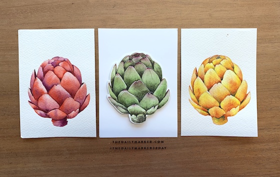
Hello Friends! I hope you all are having a good week. I’m popping in today to share my artichokes with you and I hope they inspire you to think out of the box a little when you are picking your colors.
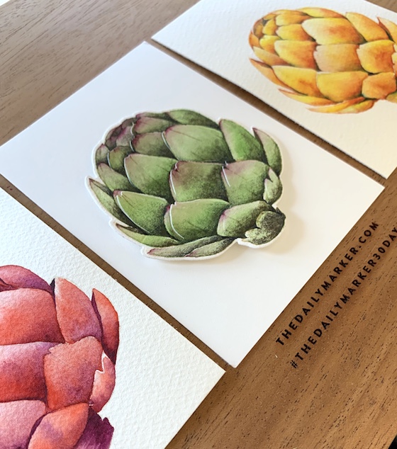
The Vintage Artichoke is a stamp (from Concord & 9th) that I love ! I wanted to color them in some vibrant summery non traditional colors. The ink I used was Gink K. Designs dark beige. This is the paper that I use for all of my watercoloring.
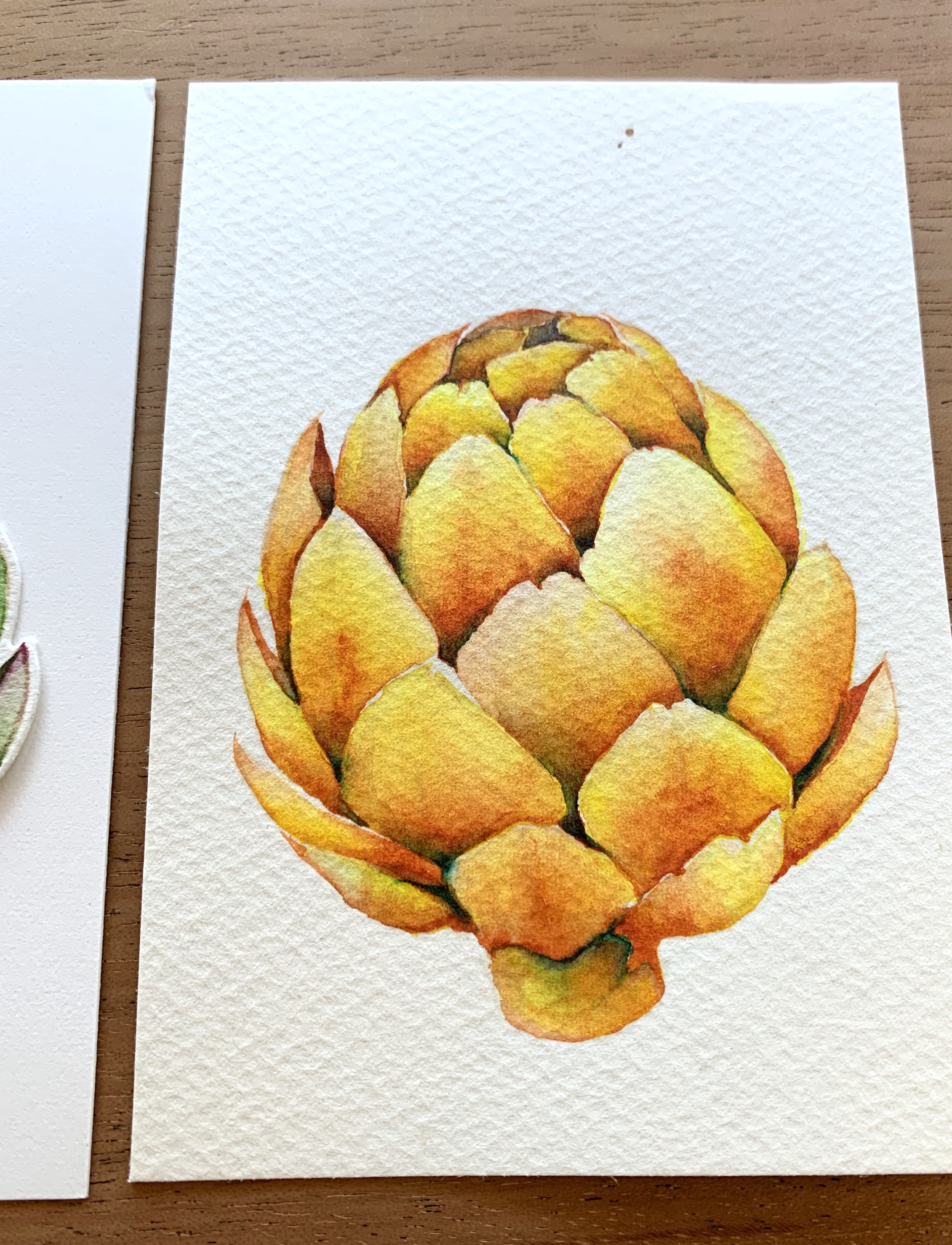
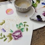
As far as paints go today I think I was using Windsor Newton. What do you think of this yellow? My first color was yellow, then pink and some navy in the nooks and crannies.
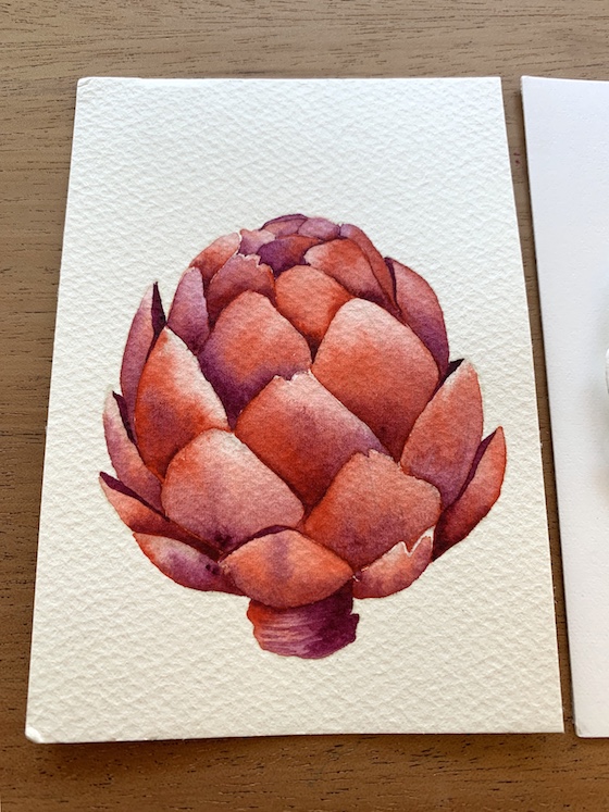
For this one I am tempted to add some darker color in those nooks and crannies with some pencils but, right now I am leaving it alone.
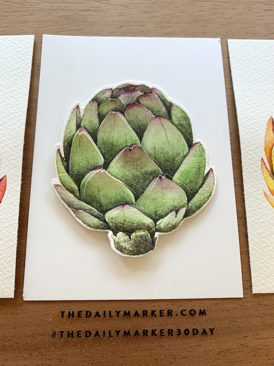
In last post I shared this same Vintage Artichoke but, I wanted to add it again here to show you the contrast with the non traditional colors. That’s it for today … I am falling asleep while writing this post lol. See you soon for a blog hop. Hugs, Kathy
 Let’s Connect Blog Hop with Simon Says Stamp
 Altenew Metallic Watercolor 14 Pan Set Release Blog Hop + Giveaway
 Gina K. Designs New Release!

So beautiful.
It almost pops off the page. Very pretty.
For me, it is SO HARD to step away from the “traditional” colors of things. LOL BUT, I am working on it! LOVE what you’ve done with these Kathy!!! ;)<3
I love all 3 of your beautifully painted artichokes!!!
I love these!!!
Stunning those vibrant colours Kathy. The original color is incredibly well colored, it still looks like a artichoke on top of a piece of paper.
My favorite is the red one, red is my colour and this is so great!
Thank you so much for sharing your out of the box artichokes, the three in a row will make awesome wall art.
Wonderful artichokes, all beautiful. I agree the red one is gorgeous and real despite being surprising. the purple/dark blue to shade the red is inspired. The green artichoke is perfection. The subtlety and skill of your coloring and shading are …. how to say genius?
These are stunning!!!
Beautiful artichokes Kathy! And I have been thinking outside the box and adding lavenders to faces, darker colors in crevices and trying to use pencils over water colors or copics. Thanks for inspiring us!
These are just amazing Kathy!
These are all so beautiful Kathy and I love that you used different colours on them. They really do look amazing
Kathy these are all gorgeous, I must try the alternative colours on some of my stamps, mind you if you see some of my colouring you might think I already do x