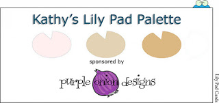
Hello Friends, Can you believe that I am back so soon?? Today Lily Pad is posting a new color challenge on the Lily Pad blog. I hope you find it fun to work with and keep in mind you don’t have to stick to the colors they are to be used as a guideline.
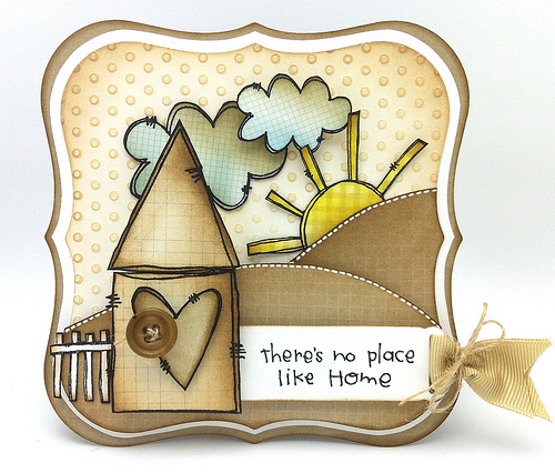 |
| I have always love this rubbah from Purple Onion Designs here and I was so happy when I discovered that they were sponsoring Lily Pad’s color challenge. My March Color Kit from Simons Says Stamp was still on my stamp desk thankfully because it was the best starting point for me. (all of the papers are from the sold out kit…hint you might want to register) |
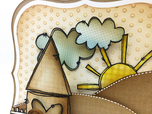 |
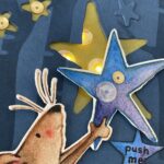
| After drying embossing the background I added some distress ink and Glossy Accents to each dot. Perfect for a rainy day with the sun trying to pop out. I also added Scattered Twig to everything on the card and some Tumbled Glass. Let me know if you have any questions. Off to Syracuse for a college visit. Hugs, Kathy Thanks for visiting me 🙂 makes me so happy. |
CARD SUPPLIES:
 Giveaway – Simon Says Stamp Card Kit
 Wrapping up Vellum Tips
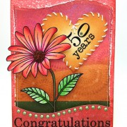 Two totally different cards today
Oooh – I ADORE this. All your yummy distressing… wow Kathy. This rocks. xxx
Wow what a gorgeous card Kathy. I love the scene it’s gorgeous. Your mono colour choice is perfect. Debbiexx
Lovely card Kathy, new to your blog.. it’s quite fun!
This type of color combination are look so creative and colorful.Buttons are really increase beauty in this cards.
Had to come here too and say how much I love your card – it is FABULOUS! LOVE EVERYTHING about it!
Hugs, Karin
OMG – this is perfection.
Gorgeous!!!!!!!!!!!!!
Beautiful card! I like very very much!!
Hugs
so so cute!
Just my colours and I can see the glossy accents on the dots, soo cute!!
Hugs, Irene
This is so ridiculously sweet, Kathy! Love the color combo 🙂
I love your card Kathy! What a beautiful use of the colors!!!
Kathy, this is such a cute card – just LOVE IT!!
wow wee I love love love this…what a fun design..
LOVE this! It’s such a deligt to look at it, the longer you look, the more you see!
WOW! I love everything about this card! Seriously…
Such an adorable design and a card Kathy! I love how you use non-traditional shapes for your cards so often!
Fab card! x
such pretty colours together Kathy. Your sun adds a touch of warmth to everything. Beautiful
Love all the texture & the monochrome colours with the touch of blue & yellow. The layering of the base panels is so effective & I love how that fence extends beyond the inner two layers & into the outermost one.
Syracuse New York?? That’s where my parents were married in 1959.
Hope the trip goes well.
Paula (PEP)
Love the GA on the dots Kathy! Adorable work on the card! I really need to get some Purple Onion stamps they’re so cute 🙂 Have fun in Syracuse!!!!
Absolutely LOVE this card Kathy! Such a beautiful card. Love the colours as well 🙂
BEAUTIFUL!
This is amazing. LOVE!
This is such a lovely card Kathy I love all the elements on it x
The earth toned colour scheme looks great. This would make a nice ‘guy’ card.
Beautiful card Kathy – I love this colour scheme and all your subtle distressing 😉
Rx
You rocked the POD stamps! Such a delightful little scene with yummy distressing! Love it!! xoxo
This is such a gorgeous little home card, great colour choice for the palette Sista!
Kathy, what a gorgeous card. I love the stamp you used & those colours xoxoxo